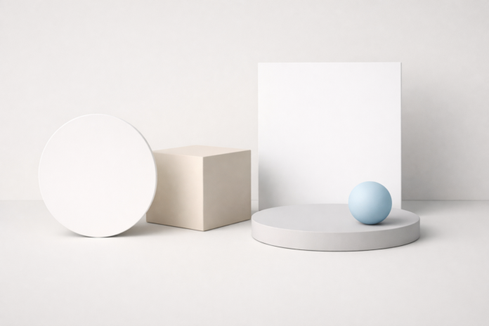
In a world overflowing with information, visuals compete fiercely for attention. Websites, apps, advertisements, and digital products all fight for a split second of user focus. This is where minimal design proves its power. By stripping away excess and emphasizing what truly matters, minimal design doesn’t just look good—it dramatically improves visual impact.
Minimalism is not about removing creativity or personality. It’s about intentional design. When done correctly, minimal design communicates faster, feels more refined, and leaves a stronger impression than cluttered visuals ever could.
Let’s explore how minimal design improves visual impact and why it has become a cornerstone of modern visual communication.
Understanding Minimal Design Beyond “Less Is More”
Minimal design is often misunderstood as plain or empty. In reality, it is a strategic design approach that prioritizes clarity, hierarchy, and purpose.
At its core, minimal design focuses on:
- Essential elements only
- Clear visual hierarchy
- Thoughtful use of space
- Purpose-driven typography and color
Every element earns its place. Nothing exists “just because.”
This discipline forces designers to think deeply about what the audience truly needs to see—and what can be safely removed.
How Minimal Design Improves Visual Impact
1. It Directs Attention Instantly
The human eye is naturally drawn to contrast and simplicity. When a design is cluttered, attention becomes scattered. Minimal design eliminates distractions, allowing the viewer’s focus to land exactly where it’s intended.
A single bold headline on a clean background often communicates more effectively than a page filled with competing visuals. By reducing noise, minimal design creates a clear visual path for the eye to follow.
The result: faster understanding and stronger engagement.
2. It Strengthens Visual Hierarchy
Visual hierarchy determines how users process information. Minimal design makes hierarchy unmistakable.
Through deliberate spacing, scale, and alignment, important elements stand out naturally. Headlines feel more powerful. Calls to action become obvious. Supporting content stays supportive instead of competing.
When everything is emphasized, nothing is important. Minimal design avoids that trap by allowing hierarchy to breathe.
3. White Space Enhances Perceived Quality
White space—also called negative space—is one of the most powerful tools in minimal design. Far from being “empty,” it actively shapes how content is perceived.
Generous spacing:
- Improves readability
- Makes designs feel calm and premium
- Allows elements to stand out with confidence
Brands that use minimal design often feel more trustworthy and sophisticated because white space signals intention and control rather than chaos.
4. Simplicity Makes Messages More Memorable
Visual impact isn’t just about grabbing attention—it’s about being remembered.
Minimal designs are easier to recall because they present fewer visual elements to process. A single strong image or symbol lingers longer in memory than a collage of competing graphics.
This is why iconic logos, landing pages, and advertisements often rely on minimalism. They deliver one clear message instead of many diluted ones.
5. Minimal Design Improves Emotional Response
Clutter creates stress, even when we don’t consciously notice it. Clean, minimal layouts feel calmer and more inviting.
By reducing cognitive load, minimal design allows users to:
- Feel more comfortable
- Stay engaged longer
- Trust the content more easily.
This emotional clarity enhances visual impact because people connect more deeply with designs that feel effortless to understand.
6. Typography Becomes a Visual Asset
In minimal design, typography isn’t just functional—it becomes a focal point.
With fewer elements on the screen, font choice, spacing, and alignment carry more visual weight. Well-crafted typography can express personality, tone, and brand identity without needing extra decoration.
This approach turns words themselves into visual elements, amplifying impact without visual clutter.
7. Color Usage Gains More Power
Minimal design often uses limited color palettes, which makes every color choice more intentional.
Instead of overwhelming users with multiple hues, minimal designs use contrast strategically:
- Neutral backgrounds create balance.
- Accent colors guide attention.
- Fewer colors increase consistency.
When color is used sparingly, it becomes more impactful—especially for calls to action and key messages.
8. It Adapts Better Across Devices
Modern audiences experience design across phones, tablets, laptops, and large screens. Minimal design adapts seamlessly to these environments.
Because minimal layouts rely on structure rather than decoration, they scale more effectively across screen sizes. This consistency strengthens visual impact by ensuring the experience feels cohesive everywhere.
Why Minimal Design Is Especially Effective Today
Attention spans are shrinking, not growing. Users expect instant clarity and intuitive experiences. Minimal design aligns perfectly with these expectations.
Search engines also favor user-friendly experiences. Clean layouts, clear navigation, and readable content all contribute to better engagement metrics—indirectly boosting visibility and performance.
Minimal design isn’t a trend. It’s a response to how humans process information in a digital-first world.
Minimal Design vs. Empty Design
It’s important to draw a clear distinction: minimal design is not the absence of content—it’s the presence of intention.
Poor minimal design removes too much and feels unfinished. Great minimal design removes only what doesn’t serve the message.
The goal is not to simplify for the sake of simplicity, but to amplify impact through focus.
Final Thoughts: The True Power of Minimal Design
So, how does minimal design improve visual impact? By doing less—but doing it better.
It clarifies messages, strengthens hierarchy, enhances emotional connection, and ensures that what matters most gets seen and remembered. In a noisy digital landscape, minimal design speaks with confidence rather than volume.
When every element has purpose, visual impact becomes effortless—and unforgettable.


